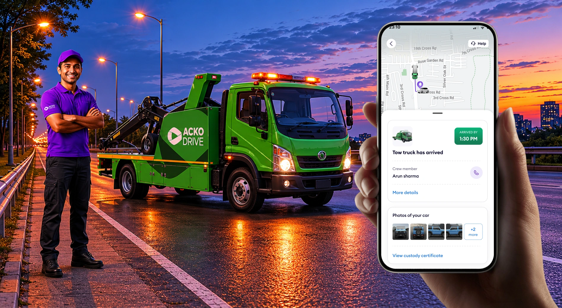
Transformed Acko's roadside assistance from a call centre into a product-led service

Acko had the service. Barely anyone knew it existed. I had to change that — and rebuild how the whole thing worked, from the first tap to the moment help arrived.

ACKO RSA
Summary

Led the 0-to-1 design of Acko's first digital RSA product — turning a phone-dependent operation into a self-serve service that handled 2,188 cases at launch and cut resolution time in half. Designed across three products simultaneously: customer app, crew Service OS, and agent portal — because the experience is only as good as its weakest surface.

50%+
Faster case registration
16 min → 8 min
2,188
Cases registered digitally
Initial launch window
~90%
Customer experience score
Post-launch
30 min
Faster average towing
84% TAT adherence
Why Acko needed this

RSA was already live — but barely. Customers called a number, waited on hold, repeated their story to three different agents, and still had no idea when help was coming.Expensive, slow, and invisible to the customers who needed it most.

Get off the phones
Every RSA request touched 2–3 agents across two teams. Allocation happened on a spreadsheet. A digital-first flow was the only path to a sustainable operation.
Sell RSA to people without Acko insurance
Phase 3 would offer RSA as a standalone paid service to anyone in the top 8 cities. The experience had to earn trust from scratch — no existing relationship to borrow from.
Turn a stressful moment into a reason to stay
A customer who uses RSA and has a good experience renews their policy. RSA was one of the highest-stakes touchpoints in the product. We were failing it.
14.1%
of customers faced a roadside emergency
~1%
actually used Acko RSA

Survey of ~500 policyholders + 6,604 call records · Jan–May 2025

What the data showed us

Less than 1% of customers were using a service that 14.1% of them needed. That gap had nothing to do with the app. People didn't know RSA existed — and the ones who did didn't trust it would work.

WHAT THE BRIEF ASSUMED
The app experience is bad. Make it better and people will use it.
WHAT THE DATA SHOWED
Users weren't avoiding the app because it was hard. They weren't opening it at all. The problem was awareness and trust.
THE REAL DESIGN CHALLENGE
Don't replace the phone call. Replace the feeling of not knowing whether anyone is coming.
THE QUESTION WE DESIGNED AROUND
"How might we make someone stranded on a road feel certain that help is coming — before they've even finished asking for it?"
How I approached the problem

RSA wasn't a greenfield app problem. It was a service design problem — with broken ops, multiple stakeholders, and users in genuine distress. The process reflected that reality.

Design philosophy — the lens behind every decision
Reduce anxiety
Confirmation that help is coming had to be immediate. Uncertainty at this moment isn't bad UX — it's a trust failure.
Build certainty
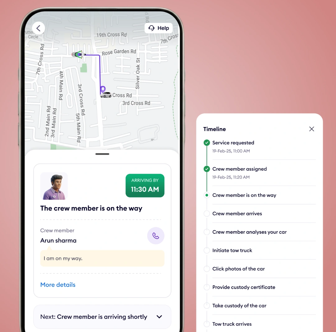
Live tracking, ETA updates, technician details — every step was designed to keep the user feeling in control.
Remove decisions
A stranded user cannot choose a tow truck type. We removed every decision that wasn't essential and owned the rest for them.
Process — what actually happened (not a retrofitted framework)
MAP
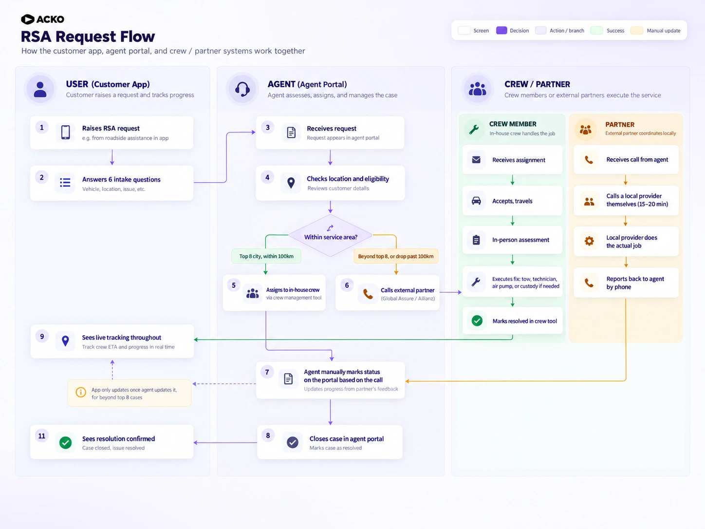
Analysed 6,604 call records and mapped the full service — every touchpoint, handoff, and failure point — before touching a screen
REFRAME
14.1% faced emergencies. Less than 1% used Acko RSA. The problem wasn't the app — it was trust.
ALIGN
Built service flows — not wireframes — as the first stakeholder artefact. Logic before UI.
ITERATE
Multiple rounds across three products simultaneously — user flows, wireframes, then hi-fi rounds with distinct feedback each time.
Where I pushed back

Every decision came down to the same tension: what operations needed to run efficiently versus what a stressed user could actually do in the moment.

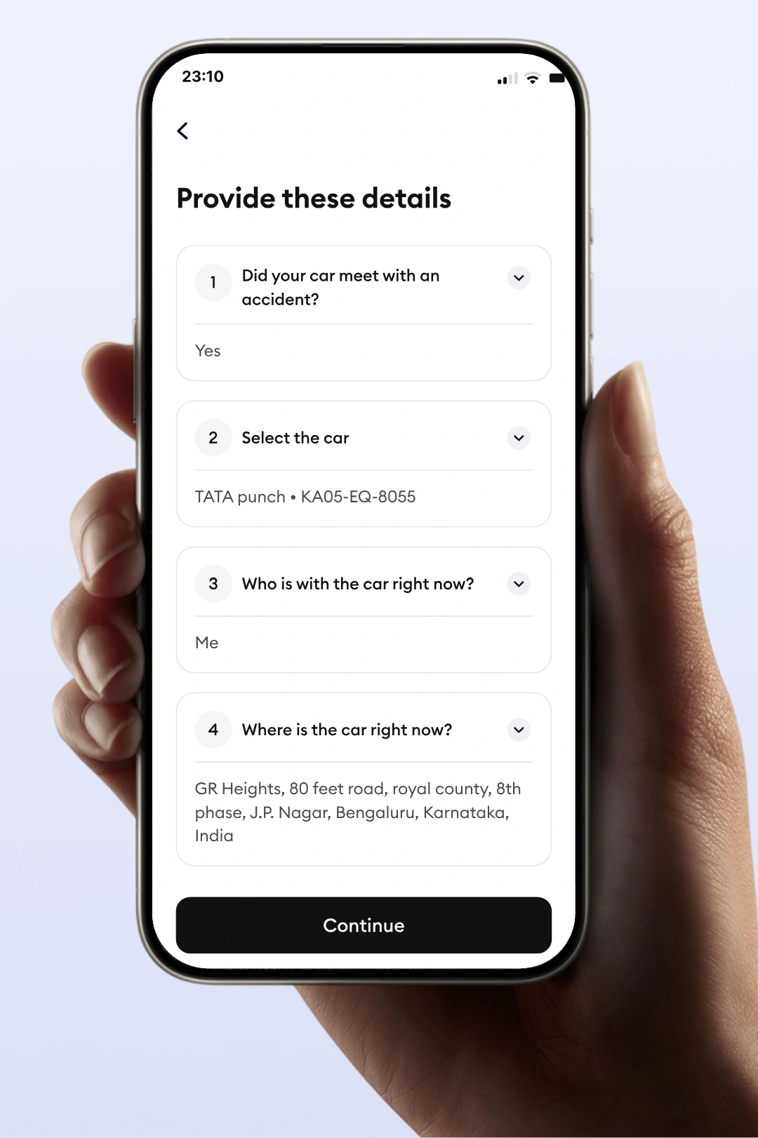
01
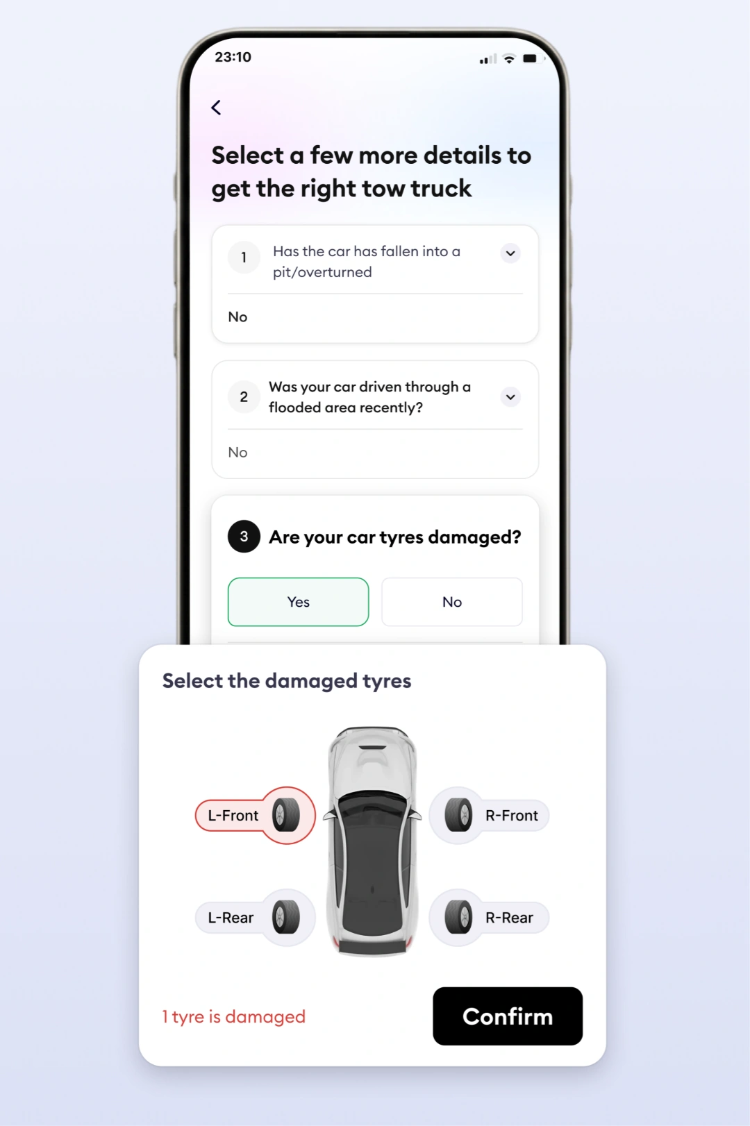
14 questions was too many — I pushed to cut it to 6
Ops needed 14 data points for dispatch accuracy. I mapped which were genuinely decision-critical and cut everything else. A person stranded on the side of a road at night will not answer 14 questions.
→ Shipped with 6 inputs. Ops got dispatch data. Users got out faster.
02
We didn't have air pump service — I made the case for adding it:
Flat tyre incidents were consistent at 7.2–7.4% across every period. Our only solution was a technician or tow truck — overengineered for a problem that often just needed air. I stayed with the argument despite pushback.
→ Air pump shipped in Phase 1. New service category added to the product.
03
We stopped asking users questions they couldn't answer
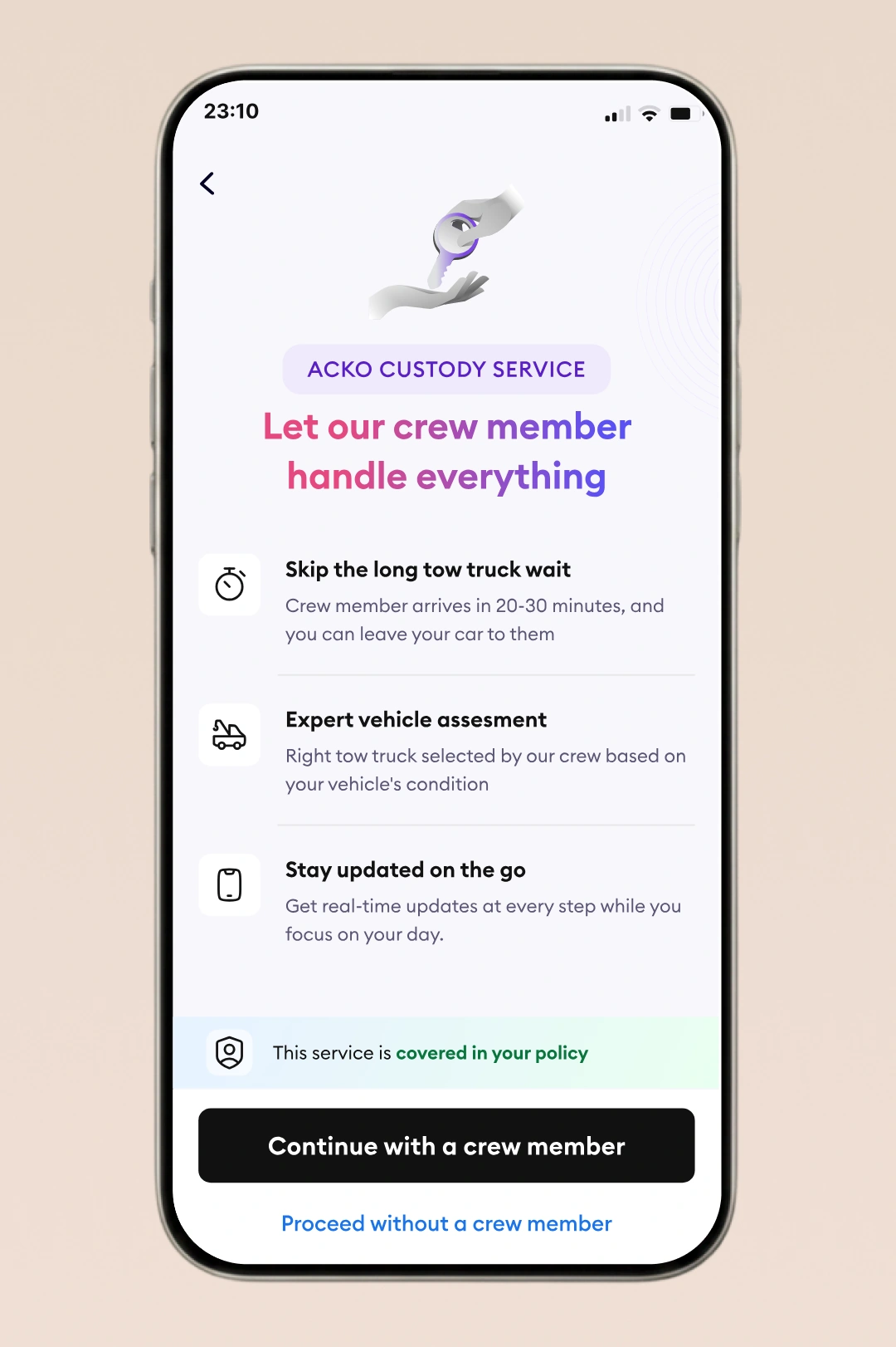
The towing flow asked diagnostic questions most users genuinely didn't know — tow truck type, neutral mode, handbrake. We defaulted to a trained custodian assessing in person and removing those decisions from the user entirely..
→ Custody became the default towing path across top 8 cities.
04
We had to deny service in one case — we made sure it didn't feel like abandonment:
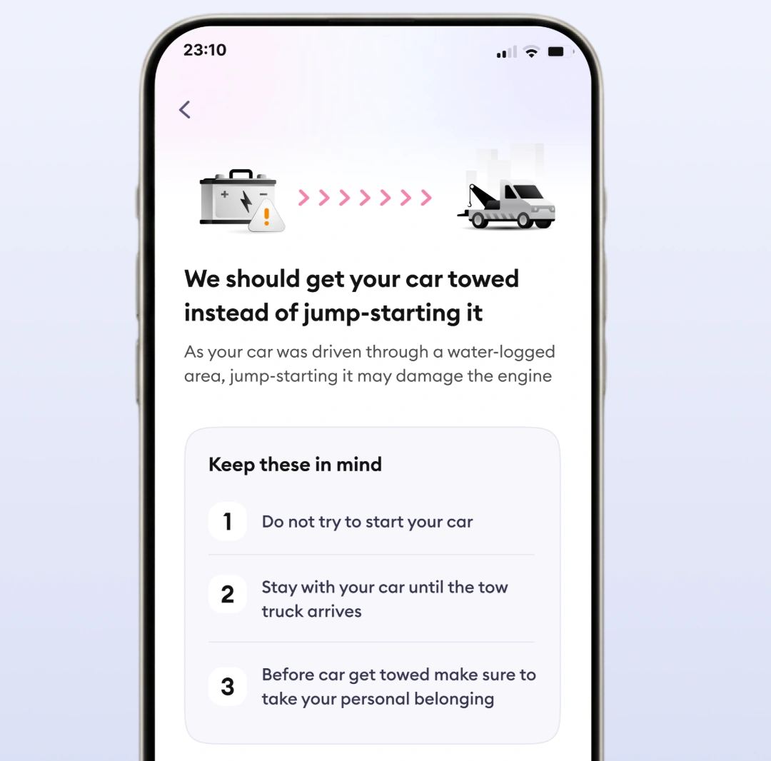
Accident towing requires a police NOC. Without one, we had to turn the user away — a policy I couldn't change. I designed a holding state that explained the constraint clearly and gave the user a precise next step.
→ Designed as an informed holding state, not a dead-end error.
How the design Evolved
Round 1 · Solution approach
Analysed 6,604 call records Reframed from trust to visibility Defined 3 design principles
Round 2 · Service flows + structure
Simplified service selection Reduced triage from 14 to 6 Made custody the default path
Round 3 · Hi-fi exploration
Dynamic entry hierarchy Confidence-building wording Escalation and edge case flows
Round 4 · Shipped ✓
22% app intake at launch Scaled to 100%
What we actually shipped

Phase 1 for RSA add-on policyholders. Phase 2 extended to all OD policyholders. Phase 3 opens to non-policyholders as a standalone paid service.

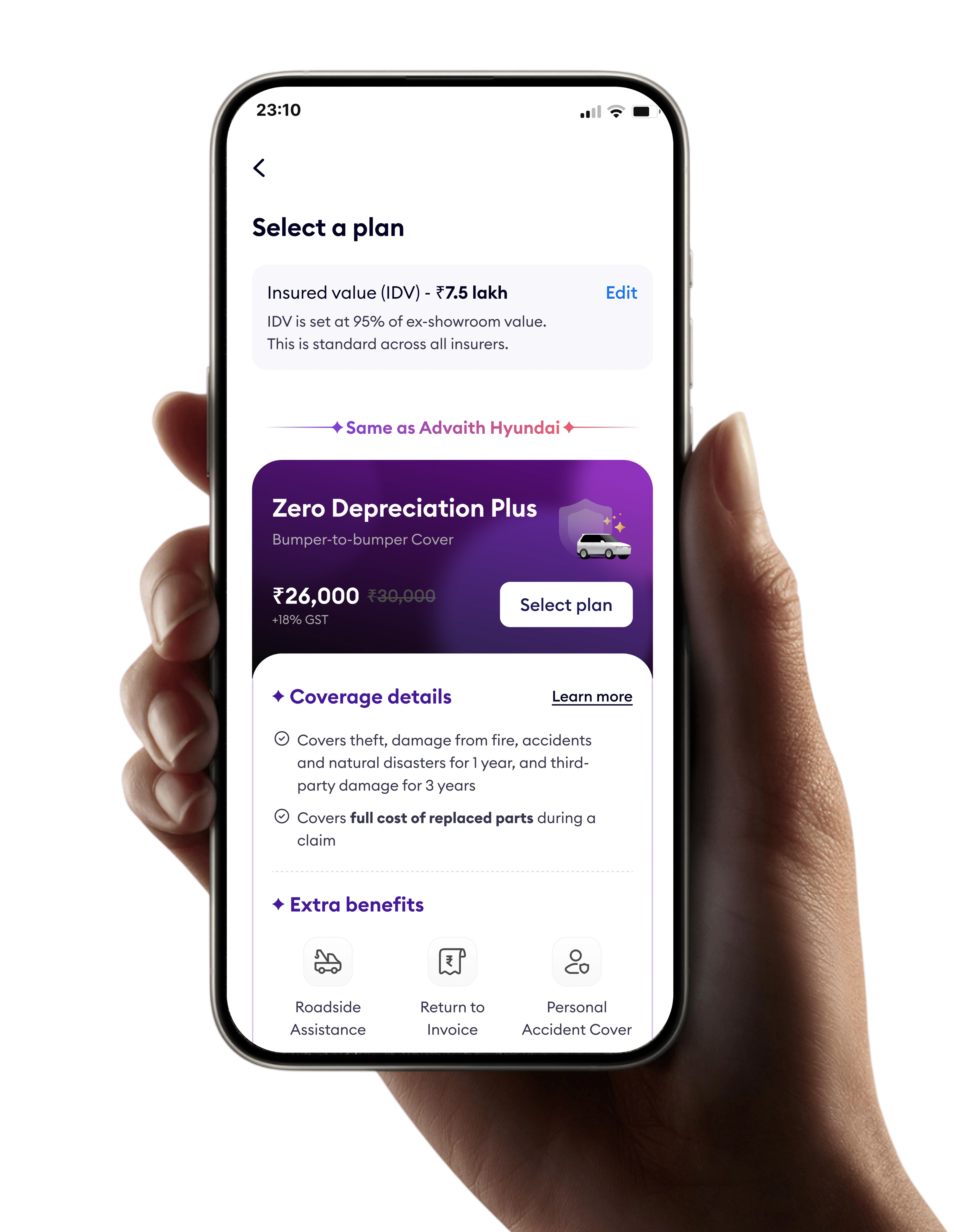
Customer App
End-to-end RSA flow
  • Emergency entry + awareness hook
  • 9 service types + adaptive probing
  • Custody vs self-serve towing
  • Live tracking + real-time ETA
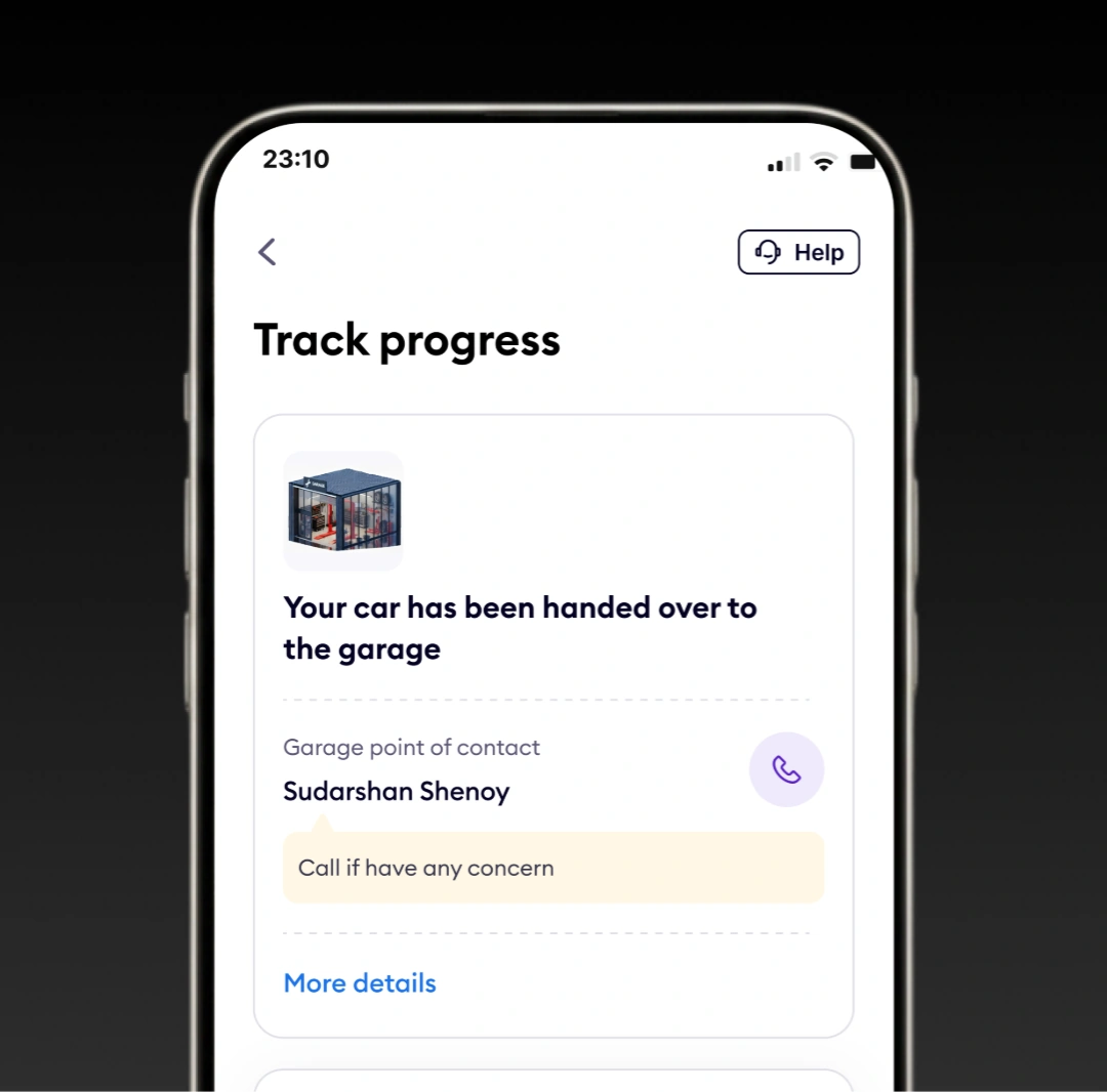
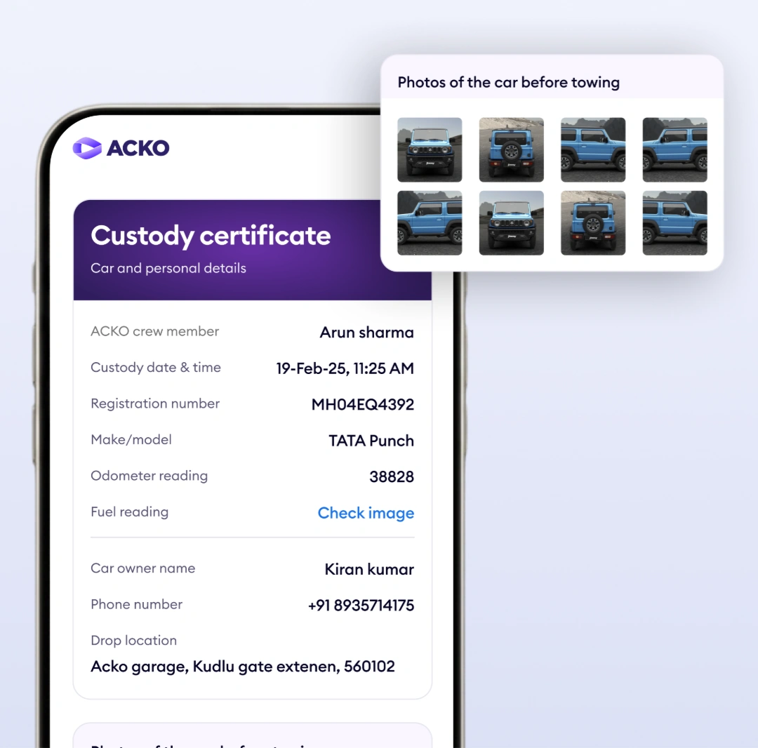
  • OTP verification + photo custody certificate
  • Payment for non-policyholders
Service OS
Crew management tool
  • Job assignment by skill + location
  • Status updates across milestones
  • Vehicle photo capture (8-angle)
  • Tow truck request on customer's behalf
Agent Portal
Internal ops tool
  • Policy lookup by phone / reg number
  • On-call booking (mirrors customer flow).
  • Manual status for partner services
  • Edge case handling
What changed after launch

The drop in support calls matters most — it means customers found what they needed without having to ask anyone. That's what the product was supposed to do.

50%+
Faster case registration
16 min → 8 min
2,188
Cases registered digitally
Initial launch window
22%
App intake at Phase 1
Scaled to 100%
~43%
Fewer support calls
~350 → ~200/week
~90%
Customer experience score
Post-launch
30 min
Faster average towing
84% TAT adherence
Key Learning
"2,188 people didn't call anyone. They opened an app, got help, and moved on. That's the only metric that mattered."
If I ran this project again
01
Service blueprints before stakeholder meetings, not during them
On complex service products, the first artefact needs to own all open questions — before anyone has a position to defend
02
Design advocacy needs a business case, not just a user case
Air pump shipped because I had demand data. Tyre puncture is still in the pipeline. Ops teams respond to numbers — user need alone isn't enough..
03
The most important constraints live with the ops team, not in the PRD
The NOC constraint appeared in a November email — months in. First week of any service project should be spent with ops, not in Figma
Final Takeaway
"The best service design isn't felt in the interface — it's felt in the moment someone realises help is already on the way."
Other key projects