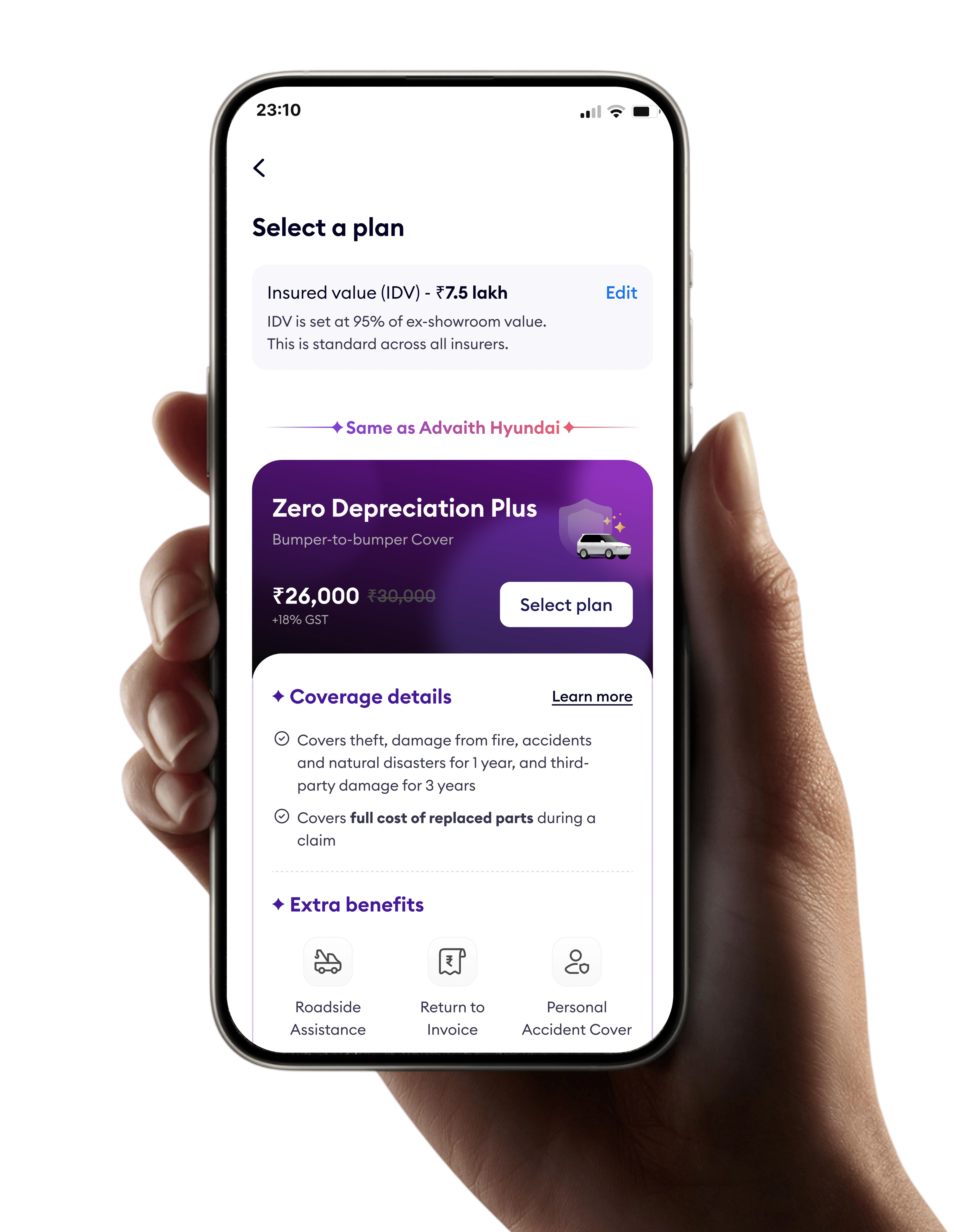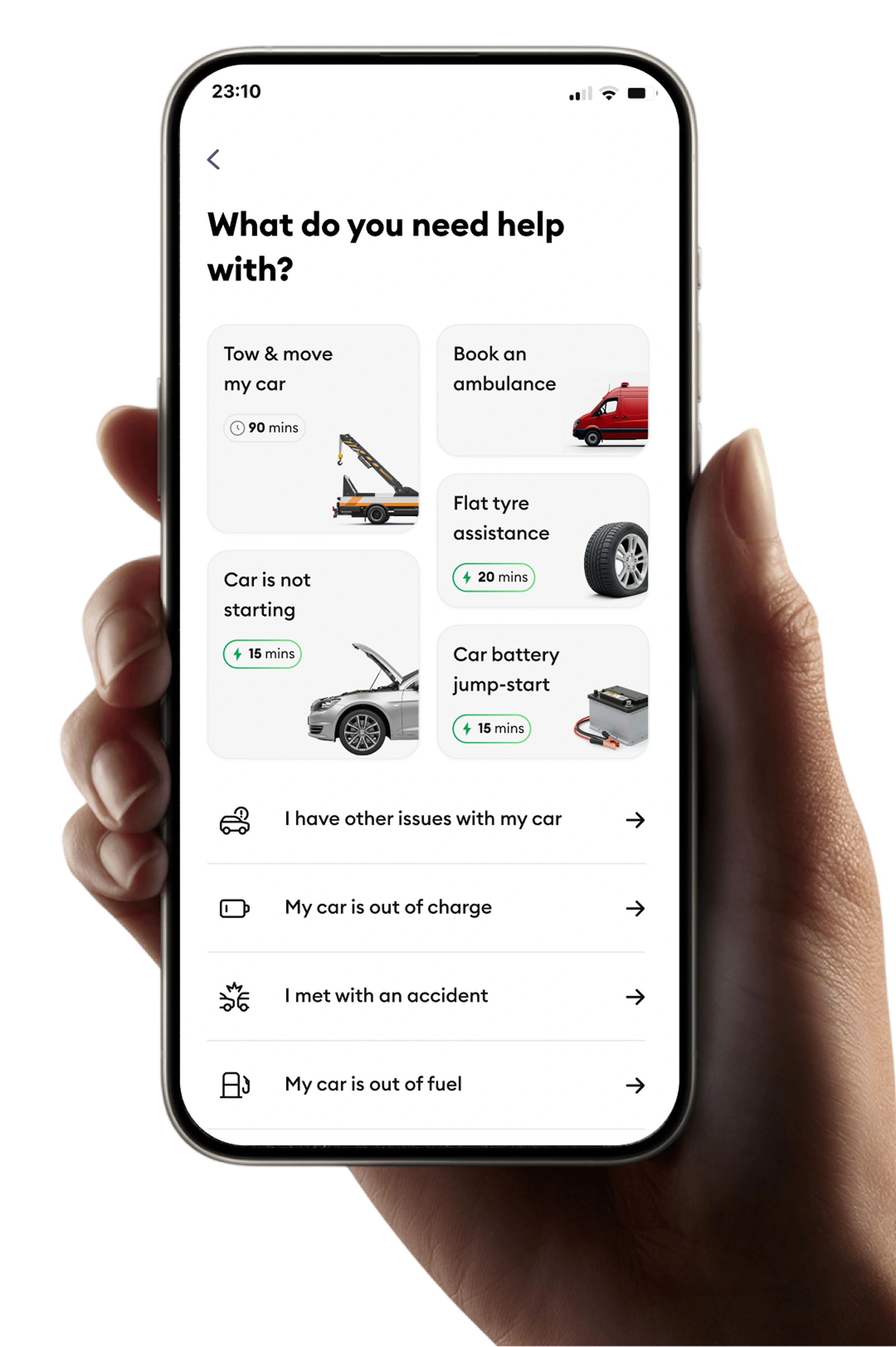
Redesigned slice's onboarding to meet identity verification requirements set by the Reserve Bank of India, India's central bank and financial regulator, while removing the friction that was causing over half of users to abandon before activation.

I looked at the existing onboarding and found a clear pattern: over half of people who started never finished. The leaks weren't scattered, they clustered at three steps.
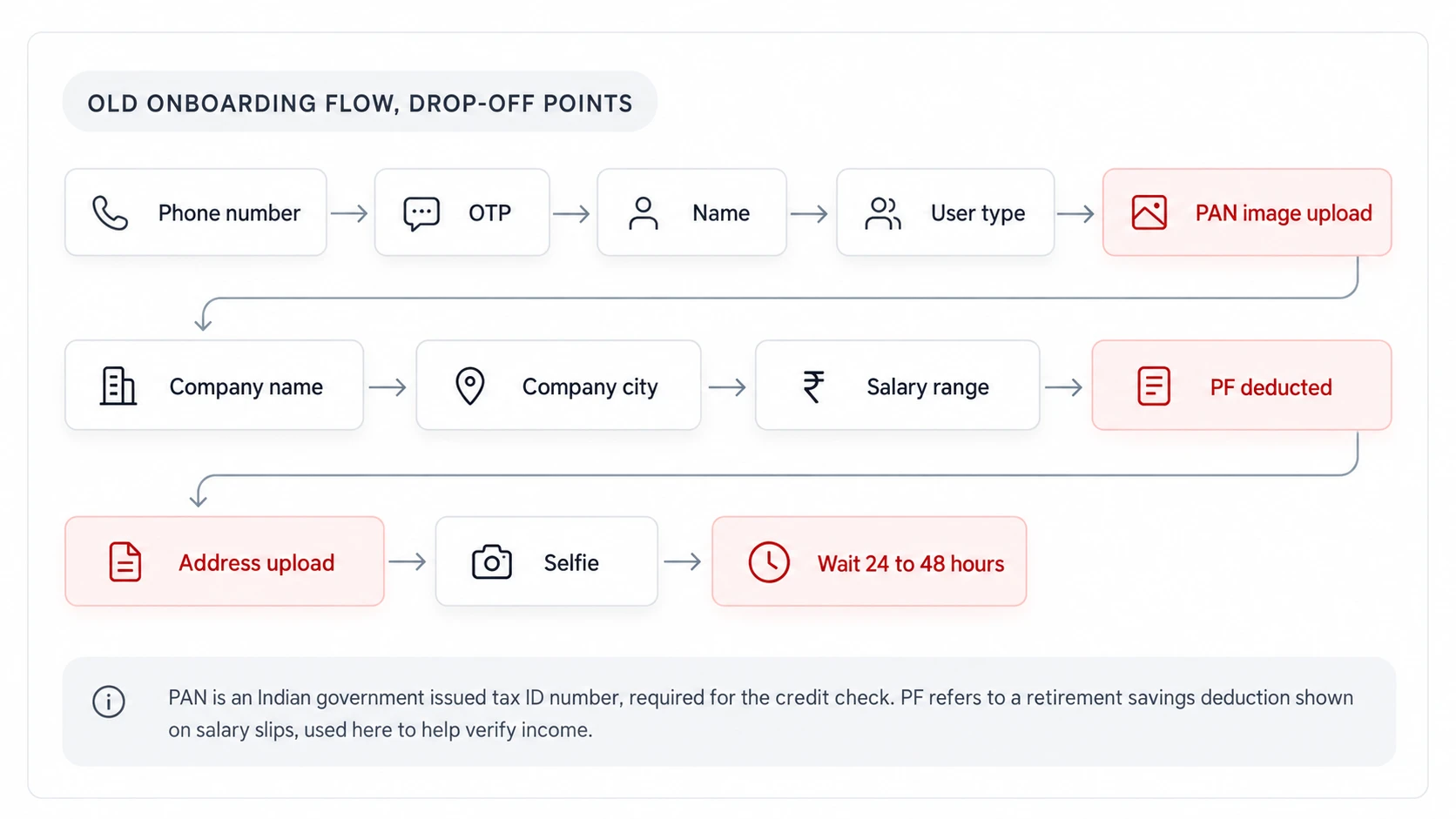
Three steps accounted for majority of abandonment: PAN image upload, address upload, 24 to 48 hour wait.
Replace manual document uploads with automatic data fetches, and remove the old wait entirely so approval shows the moment verification finishes, not one to two days later.
I grounded the redesign in two user types we kept seeing in interviews, first-timers who needed reassurance, and experienced users who refused to re-enter data slice already had.
Works in IT, shops online, uses finance apps
“If I qualify, show me something now, then I'll finish the rest.”
Manager in a Tier-2 city, already owns a card
“Don't make me enter what you already have from my PAN.”
I combined funnel analytics, user interviews, and competitor review. Three insights shaped every decision that followed.
Analytics confirmed biggest exits at PAN image upload, proof of address upload, and 24 to 48 hour activation wait. These became the primary targets.
In five interviews, every single person said being asked for documents before knowing anything about their approval felt unfair. This told me the credit check itself needed to happen, and show something back to the user, before asking for the remaining verification steps.
CRED and Paytm, other Indian fintech apps, both deferred some identity verification steps until after provisional approval. I used this as evidence to bring to the legal team.
I explored four directions. Three I rejected. One I took to legal and shipped.
Safest option for compliance, no work left after approval.
High drop off at the document upload steps, long time before the user sees any value.
Keeps the exact problem we were trying to fix.
Easier to start, no backend changes needed.
Still asks for address proof upfront, the actual friction stays.
Fixes how the form feels, not what's actually causing people to leave.
Faster total time if everything works.
More technical complexity connecting both systems at once, and if either check fails, the user has gone through both processes for nothing.
The failure case is worse than the current slow version.
Removes manual document uploads entirely for most users, and removes the old one to two day wait since verification now happens automatically and fast.
Needs real backend work, connecting to the credit bureau, an agency that holds a person's credit history and score, the national identity registry, and getting compliance sign off on the new sequence.
This is the only option that fixes all three of the actual drop off points, PAN document upload, address document upload, and the long wait, while keeping every regulatory requirement fully intact.
I connected the flow to the credit bureau and to CKYC, a shared national registry that stores identity verification someone has already completed elsewhere, so it doesn't need to be repeated. For the small number of people not already in CKYC, we ran a quick Aadhaar check, India's national identity number system, instead of asking for a document.
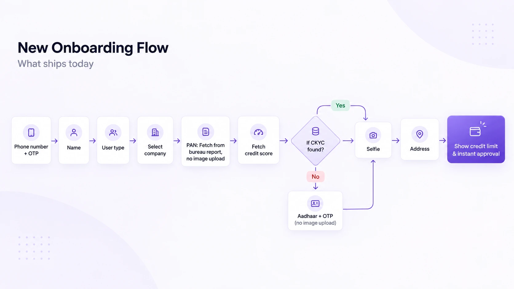
Every manual document step from the old flow became an automatic fetch. The only thing still asked of the user directly is a selfie.
I built the flow around one idea: show the credit score early, automate every document step that used to need a manual upload, and end with the approved limit instead of a wait screen.
The redesign moved the completion rate from 45% to 82%. Forty percent of users finished sign-up in under two minutes.
What I'd do again